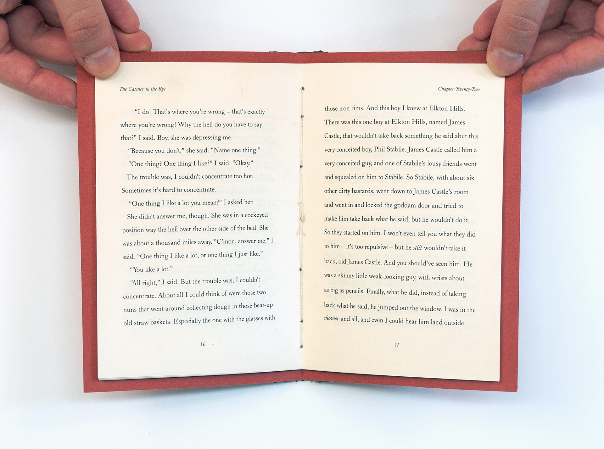
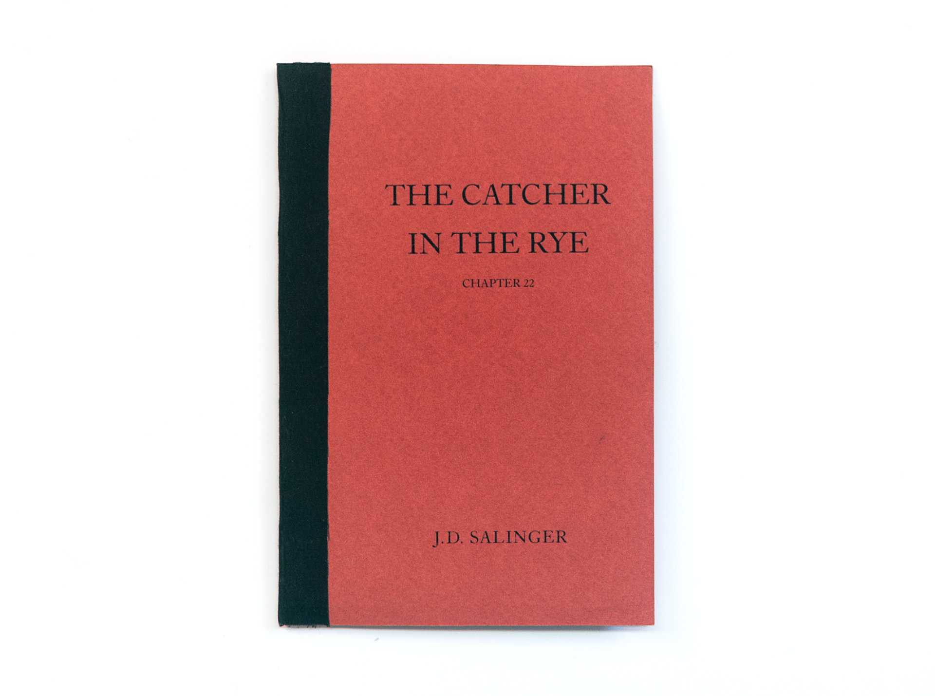


One of my first design projects in college, I was asked to pick a specific chapter from a favorite book, design the text and assemble a chap(ter) book. My novel of choice was The Catcher in the Rye by J.D. Salinger, specifically chapter 22. In this chapter we learn the concept behind the book's unique title. By keeping in mind the concept of Warde’s Crystal Goblet, I allowed the typeface as well as the text blocks to aid in a satisfying read through of this significant chapter in Salinger’s famous novel.